Tuesday 15 April 2014

Hacking a Wordpress website using SQL injection

Hacking a Wordpress website using SQL injection 


Today i am gonna show you how to hack a website using sql injection.To find SQL vulnerable sites refer to this post.

Now Lets start---->

Things you will need -->
1. Havij SQL injection Tool, download it from here(Run as Administrator)
2. A sql vunerable site, I am taking this site http://toyonorte.com.co/catalogo_nuevos_detalle.php?id=2 as an example.
3. A very important thing i.e mind.

Checking for sql vulnerability --->
Here i am taking http://toyonorte.com.co/catalogo_nuevos_detalle.php?id=2 as an example. 
Now to check is this site vulnerable to sql, I will simply add ' after the site url
like this http://toyonorte.com.co/catalogo_nuevos_detalle.php?id=2'
and i get this error on the site
You have an error in your SQL syntax; check the manual that corresponds to your MySQL server version for the right syntax to use near '\'' at line 1
It means that site is vulnerable to sql injection.

Exploiting the vulnerable site ---> 
1. Open Havij and paste site url in target field and hit enter
.
2. Now wait for Havij to get all the databases of the website.

3. Now click on available databse of site and click on Get Tables like i am gonna select 535480_toyonorte of my site like in image.

4. By clicking Get Tables Havij will look after the tables available in the database.

5. Now after the scanning Havij will get all tables, now the main work start , you have to check it there table available named as admin, users and something similar to these words like i get usuario in my website and select it and click onGet Columns. Like in pic given below.


6. Now after clicking Get Columns havij will get all the columns available in users table.

7. In my case i found diffrent columns like id, login, pass an many more.

8. Now select the columns and click on Get Data like in pic given below.


9. Now havij will look after the data available in columns login and password i.e admin username and passowrd like i get 
username --> adminpassword--> 21232f297a57a5a743894a0e4a801fc3 (in encrypted form)
Like in image below

10. Now after i get username and password there is a problem that passowrd i s encrypted in mdm language , so we have to crack it .

11. To crack encrypted password just copy password click on MD5 tab in havij and paste the encrypted password in MD5 hash field and hit start.Now havij will try to crack the password. Like i cracked in image given below.


12. Now i get Password cracked as admin.

13. Now we will check for admin panel where we gonna login with username and passoword.

14. To find admin panel click Find Admin tab in Havij and click start. Now havij  will check the admin panel of website.
In my case i found http://toyonorte.com.co/admin/ as admin panel, now open it in a web browser and login with username and password and now you are in admin panel.

Notes--->

1. Website hacking is illegal
2. Use proxy, tor, vpn for your security.
3. This is for only educational purpose.

Whats next-->

In next post i am gonna show you how to upload shell through admin panel in a website.
So keep updated and visit site daily and also refer your friend...

Tuesday 8 April 2014

How to Hack Your Facebook Account

How to Hack Your Friend’s Facebook Account:

  • First of all, create three new Facebook Accounts and add all these three accounts in your friend’s friend list. If you are done with the first step then you have done 90% of your work.
  • Click on Forgot your Password button. It will show three options to recover your password.
  • In the first option give his Email Address and in the Name field give your Friend’s Full Name, your name and click on Search button.
  • Now if everything goes well you will see the profile picture of that person. Here click on the No longer have access to these.
  • Now Enter your New Email address which doesn’t associated with any facebook account yet and click on Submit button.
  • Now you will be prompted to Security question. If you know the answer then it is well and good otherwise, give wrong answers for three times.
  • Now after three unsuccessful attempts, it will ask you to recover your account with trusted friend feature. Click on Continue button.
  • It will ask you to choose three friends. Select your created accounts from the list and click on Continue button each time.
  • After selecting three friends, Facebook will send security codes to the Email address associated with those fake accounts. Login to each account and fill the security codes in the same manner. Also check spam messages if it is not there.
  • Now you will get password Reset Email on Email Address that you have entered in 5th step (New Email address which doesn’t associated with any facebook account).

    That’s it..! You have hacked your friends Facebook Account. Enjoy..!!

Tuesday 1 April 2014

7 Best Practices of Responsive Web Design

7 Best Practices of Responsive Web Design


This is where responsive design can come into the picture and save your day nicely. However, with responsive design, as with anything in website design, you need to make sure that you follow along with some crucial best practices if you want your responsive site to actually work well and provide the flexibility it’s supposed to.

Mobile Users Deserve the Same Quality of Browsing Experience

7 Best Practices of Responsive Web Design
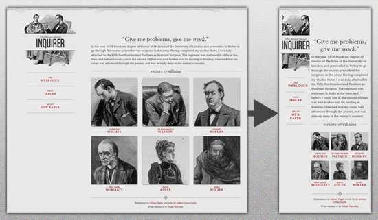
One of the first and foremost principles to keep in mind when creating a responsive design site is making sure that the site is built so that the browsing experience is evenly the same for all users across the board.
This means that your site’s appearance and visual structure should change without ever creating content and function losses for users of any specific device or screen size. A visitor accessing your pages from their desktop should be getting the same sort of browsing experience as a visitor coming in through their smart phone or their tablet.
This means flexible everything and requires that you ensure all of your image, content and grids are fully fluid and will reconfigure accordingly on a wide assortment of screen sizes, such as these, which are only a small sampling of the very most popular screen sizes you’re likely to deal with.
The result should be a site that converts as nicely as
7 Best Practices of Responsive Web Design

Design your Site with Responsive in Mind

When you’re wire framing your site layout together for coding into a real design, understand that there are layouts which are ideal for responsive design and those which are not, meaning there are designs that convert to assorted new sizes better than others thanks to their layout.
This means designing as simple a site layout and HTML code as possible and using simple mechanisms for core elements such as navigation and menu options, using HTML5 guidelines and doctype, and a simple overall core layout.
What you should avoid completely are things such as overly complex divs, useless absolute positioning, and fancy Javascript or Flash elements that will just complicate site adjustment on the whole.

Pay Attention to your Breakpoints

Resolutions can be defined in an assortment of breakpoints, but there are several major sizes that you need to focus on more than any others. These being:
<480px (which applies to older, smaller smartphone screen sizes)
<768px, which is ideal for larger smartphones and smaller tablets
>768px, which applies for everything bigger such as large tablet screens and desktops screens.
Also, these can be used too if you’ve got the energy and time:
<320px, which is great for older small, low res phones
>1024px stylesheet for wide screens on desktops.
These are the key breakpoints to focus on and especially the first three as well as the full desktop resolution, which is greater than 1024px.

Make your Images Flexible and Workable

With a simple design, you can make your images flexible as well to a certain degree. The easiest way to accomplish this is by simply using adaptative sizing and resizing their width.
You can do this in a variety of ways, but one of the easiest methods through which to achieve it is with this handy little tool: Adaptive Images. Bear in mind that sizing accordingly for mobile users is probably your best bet on a responsive design site if you want decent load speeds, which are absolutely crucial.
7 Best Practices of Responsive Web Design
You could also use variable breakpoints and store multiple image sizes in your data for different screen resolutions, but this might become a problem in terms of bandwidth usage, and you cannot create your site with the safe assumption that all of your viewers will have access to powerful bandwidth.

Allow Compression of Site Elements and Content

Use a program such as GZIP to compress your page resources for easier transmission across networks. You’ll have lowered the number of bytes sent per page or element and made your content easier to browse and access from devices with varying or low bandwidth.
Furthermore, you can speed things up even further by removing any unnecessary white space and line breaks. Doing this will reduce file sizes overall and keep things flowing more smoothly.

Get Rid of Non-Essential Content

In order to make your mobile friendly responsive design site really shine in a very easy to achieve way, simply bear one thing in mind: Some content and content elements were never meant to be used in a mobile context and would never work there.
If you have these elements at play in your website or potential site layout, then get rid of them immediately for any mobile setting. You can do this by adding a .not_mobile class to specific elements that you’d like to see removed when your site is viewed in a mobile context or you can simply get rid of such elements permanently from all versions of your site.

Remember the Bottom Line

The above are just some of the major best practices you can try out, some of the more important ones.
Ultimately however, if you want your responsive design site to work well, you need to build it so that it can load and function quickly on devices that will often have low resolution, small processing power and sometimes weak bandwidth access. This means a simple, well organized site that conforms to its core function with maximal focus.