Craft Blog UK: Makeover your blog - Blogger themes
Cheap Web design India
Saturday 6 June 2015
Thursday 28 May 2015
Shadowy Web Site Creates Blacklist of Pro-Palestinian Activists
A new website is publicizing the identities of pro-Palestinian student activists to prevent them from getting jobs after they graduate from college. But the website is keeping its own backers’ identity a secret.
“It is your duty to ensure that today’s radicals are not tomorrow’s employees,” a female narrator intones in a slick video posted to the website’s YouTube account.
Called Canary Mission, the site has posted profiles of dozens of students and recent graduates, alongside those of well-known activists like Omar Barghouti, founder of the Boycott, Divestment and Sanctions movement. Some of the students are active in Students for Justice in Palestine; others were involved in recent pro-BDS resolutions at campuses in California. Many of them have relatively thin activist résumés.
“The focus on young people and students is an effort to try to tell people that there will be a price for you taking a political position,” said Ali Abunimah, founder of the pro-Palestinian website The Electronic Intifada. “It’s an effort to punish and deter people from standing up for what they believe.”
Daniel Pipes, president of the Middle East Forum, defended the tactic as a way of forcing people to understand the seriousness of their political stands.
“Factually documenting who one’s adversaries are and making this information available is a perfectly legitimate undertaking,” Pipes wrote in an email. “Collecting information on students has particular value because it signals them that attacking Israel is serious business, not some inconsequential game, and that their actions can damage both Israel and their future careers.”
Despite its dedication to documenting the identities of pro-Palestinian activists, Canary Mission seems to have gone to great lengths to keep the identities of its own members and backers well hidden. There are no names of Canary Mission staff members, volunteers, donors or allies on the site.
The Web domain is registered in a way that hides its ownership. Though the site says that Canary Mission “is a non-profit organization,” no group called Canary Mission is currently registered with the IRS as eligible to receive tax-deductible contributions, and the website indicates no fiscal sponsor through which it can accept donations. The group’s MailChimp account identifies its ZIP code as 10458, a corner of the Bronx that includes Fordham University.
A person named Joanna responded via email to a request for comment from the group, agreeing to an interview but then not calling this reporter over two days. Joanna also did not respond to a list of questions submitted about the group.
A handful of right-wing pro-Israel groups that focus on campuses said they had no relationship with Canary Mission, including the David Horowitz Freedom Center, Pipes’s Middle East Forum, the AMCHA Initiative and StandWithUs.
When asked whether his group had supported Canary Mission, Charles Jacobs, who runs Americans for Peace and Tolerance, a far-right group that purports to expose extremism on campus, said he had no comment. Jacobs is the founder of The David Project, which, under his leadership, produced a 2004 documentary titled “Columbia Unbecoming” that depicted Columbia’s Middle East studies department as unfriendly to Jewish students.
Distributing lists of activists and their activities is not an entirely uncommon tactic in the Middle East debate, on the left or the right. A website called Masada2000, now offline, maintained what it called the “Self-Hating and/or Israel Threatening” list of Jews whose views it considered unacceptable. In early 2014, the anti-Zionist blog Mondoweiss uncovered a password-protected website maintained by StandWithUs that contained backgrounders on pro-Palestinian speakers on the campus circuit. On the left, the website for Right Web, a program backed by the Institute for Policy Studies, profiles hawkish pro-Israel groups and activists.
The individual dossiers on the Canary Mission’s site are lengthy and detailed, and include videos and photographs of the activists. In the case of some current students, the site lists their majors. There are links to Facebook pages, Twitter pages and LinkedIn profiles, and lengthy descriptions of pro-Palestinian student groups and movements to which these students have alleged links.
“I think it’s creepy and I think it’s McCarthyist,” said Max Geller, an SJP member who is profiled on the site. “This is not a badge of honor. This is scary.”
Wednesday 7 May 2014
How to Build The Ultimate Adobe Photoshop CS6 PC
Building the Ultimate Photoshop CS6 PC.
Here is the dawn of the highly anticipated Photoshop CS6. Photoshop has always been a power hungry application which pushes the most powerful of desktops to their limits.
Even the smallest bottleneck can have your system on its knees and you sat around twiddling your thumbs waiting for it to load.
It goes without saying, the better and more powerful your PC is, and the easier it will handle the pressure put upon it by Photoshop.
Today we are going to illustrate to you the best set up for using Photoshop CS6 to its full potential.
To start with the basics, you are going to need the following: -
• A high-end processor.
• Lots of lovely Ram
• A large hard drive
• A graphics card which supports GPU-Acceleration found in CS6.
• Lots of lovely Ram
• A large hard drive
• A graphics card which supports GPU-Acceleration found in CS6.
Lets have a look at these four basic in a bit more detail.
Processor
For high demand graphical applications, Intel processes truly triumph over AMD processors. With Photoshop CS6 the speed of the CPU really does make a difference, so if you want the best out of this software opt for an Intel CPU.
You also need a quick powerful CPU, so I would definitely recommend a Core i7 processor, maybe the 3.6ghz if your budget allows. This will set you back around £250 but is the core of your system. If your going to spend big on any of the computer hardware needed, then make it the processor.
RAM
To really see this software cruise along flawlessly you're going to need RAM and plenty of it. I stress this when I say it, an absolute minimum of 8GB but anything up to 16GB or 32Gb, if your motherboard will accommodate it.
You don't need the really quick ram associated with gaming PCs, so stick with stable high quality RAM from brands like Crucial or Kingston and you wont really go wrong. Not only will you get robust and stable memory but they also come with rock solid warranties so if the RAM goes wrong, they will replace it for you.
Storage
If you're doing a lot of high-end graphic work your going to need plenty of storage space. This isn't because the program itself is big, but the files, which output can be.
In an ideal world you will need four drives. I know this sounds a lot, but we are building the Ultimate CS6 PC, so four drives is the only way to get optimal performance. Ill explain why. One for your operating system, one for the your files and one for what is called the "scratch disk".
The scratch disk is a part of the hard drive which Adobe uses as virtual memory.
You can use fewer drives if you wish, but the most common reason for performance slow down is bottlenecks and having just one disk for everything will create bottlenecks. The cost of computer hardware is cheap these days and especially hard drives, spending money in this area will pay off.
Graphics Card
The new Photoshop CS6 runs on Adobe new Mercury Engine which is equipped with new GPU Acceleration tools such as blur and liquefy and more wide angled effects.
To make the most of these new tools you will need a graphics card from the new NVIDIA Quadro range and these aren't something you will find in a normal high street bought PC.
The Quadro graphics cards can be very expensive, but you will not need the top of the range, even the modest Quadro 2000 will suffice.
When you put all these together you should have the hardware which will allow you to experience the best of Photoshop CS6 in all its glory. This is a very capable piece of software which will push to Computer Hardware of today to its very limits, but the end result if something quite spectacular.
Web design company indiaTuesday 6 May 2014
Protect Your Websites From Malware and Hackers Using the Best WordPress Security Plug-Ins
Although there are plenty of WordPress plug-ins available nowadays, which claim to protect your website from different malware and hacker attacks, it is still very important to choose the best WordPress security plug-in that can prevent hackers from inflicting malicious scripts or codes onto your site. To help you with this concern, here are the top three WP security plug-ins that you can use.
Better WP Security
One of the easiest and most effective ways to secure your WordPress site is through the use of the Better WP Security plug-in. This security plug-in takes the best WordPress security features and techniques that can patch as many security holes as possible without removing any important scripts from your site or creating any conflicting features. This works by reducing or hiding the vulnerabilities of your site, such as bad usernames and bad database table prefixes, thus providing roadblock to hackers trying to get sensitive information from your sites such as your login details or admin passwords.
Locker Press WordPress Security
Another most widely used plug-in for securing WP sites is the Locker Press WordPress Security. This one offers a variety of solutions that enables you to modify areas of WordPress, which are normally too difficult to manipulate. Some of its key features are change admin user, email notification of failed login attempts, enable HTTP authentication, enable re-CAPTCHA on login page and change database prefix.
Bulletproof Security
The Bulletproof Security, on the other hand, is specially designed to protect your site from XSS, RFI, CSRF, Base64, SQL injection hacking and code injection. This plug-in is easy to use and quick to learn, allowing you to experience a single-click solution that creates, copies, writes, moves or renames files into the Bulletproof Security (BPS) mater files. It also enables you to activate. htacess security on maintenance modes within your WP dashboard.
The Need for Upgrading your Plug-in Versions
While the use of these security plug-ins do not guarantee to keep your website free from malicious scripts, malware or hacker attacks for the longest possible time, it is highly recommended for site owners to upgrade their website security plug-ins on a constant basis. This will help reduce or prevent hackers from deciphering and attacking your WP site's vulnerabilities.
It is also advisable for site owners to use stronger passwords for their admin section, web host control panel and database. Another alternative is they could hire a WordPress security service that has all the knowledge and expertise on handling these problems and meeting their specific needs or requirements.
Tuesday 15 April 2014
Hacking a Wordpress website using SQL injection
Hacking a Wordpress website using SQL injection
Today i am gonna show you how to hack a website using sql injection.To find SQL vulnerable sites refer to this post.
Now Lets start---->
Things you will need -->
1. Havij SQL injection Tool, download it from here(Run as Administrator)
2. A sql vunerable site, I am taking this site http://toyonorte.com.co/catalogo_nuevos_detalle.php?id=2 as an example.
3. A very important thing i.e mind.
Checking for sql vulnerability --->
Here i am taking http://toyonorte.com.co/catalogo_nuevos_detalle.php?id=2 as an example.
Now to check is this site vulnerable to sql, I will simply add ' after the site url
like this http://toyonorte.com.co/catalogo_nuevos_detalle.php?id=2'
and i get this error on the site
You have an error in your SQL syntax; check the manual that corresponds to your MySQL server version for the right syntax to use near '\'' at line 1
It means that site is vulnerable to sql injection.
Exploiting the vulnerable site --->
1. Open Havij and paste site url in target field and hit enter
.
2. Now wait for Havij to get all the databases of the website.
3. Now click on available databse of site and click on Get Tables like i am gonna select 535480_toyonorte of my site like in image.

4. By clicking Get Tables Havij will look after the tables available in the database.
5. Now after the scanning Havij will get all tables, now the main work start , you have to check it there table available named as admin, users and something similar to these words like i get usuario in my website and select it and click onGet Columns. Like in pic given below.

6. Now after clicking Get Columns havij will get all the columns available in users table.
7. In my case i found diffrent columns like id, login, pass an many more.
8. Now select the columns and click on Get Data like in pic given below.

9. Now havij will look after the data available in columns login and password i.e admin username and passowrd like i get
username --> adminpassword--> 21232f297a57a5a743894a0e4a801fc3 (in encrypted form)Like in image below

10. Now after i get username and password there is a problem that passowrd i s encrypted in mdm language , so we have to crack it .
11. To crack encrypted password just copy password click on MD5 tab in havij and paste the encrypted password in MD5 hash field and hit start.Now havij will try to crack the password. Like i cracked in image given below.

12. Now i get Password cracked as admin.
13. Now we will check for admin panel where we gonna login with username and passoword.
14. To find admin panel click Find Admin tab in Havij and click start. Now havij will check the admin panel of website.
In my case i found http://toyonorte.com.co/admin/ as admin panel, now open it in a web browser and login with username and password and now you are in admin panel.
Notes--->
1. Website hacking is illegal
2. Use proxy, tor, vpn for your security.
3. This is for only educational purpose.
Whats next-->
In next post i am gonna show you how to upload shell through admin panel in a website.
So keep updated and visit site daily and also refer your friend...
Tuesday 8 April 2014
How to Hack Your Facebook Account
How to Hack Your Friend’s Facebook Account:
- First of all, create three new Facebook Accounts and add all these three accounts in your friend’s friend list. If you are done with the first step then you have done 90% of your work.
- Click on Forgot your Password button. It will show three options to recover your password.
- In the first option give his Email Address and in the Name field give your Friend’s Full Name, your name and click on Search button.
- Now if everything goes well you will see the profile picture of that person. Here click on the No longer have access to these.
- Now Enter your New Email address which doesn’t associated with any facebook account yet and click on Submit button.
- Now you will be prompted to Security question. If you know the answer then it is well and good otherwise, give wrong answers for three times.
- Now after three unsuccessful attempts, it will ask you to recover your account with trusted friend feature. Click on Continue button.
- It will ask you to choose three friends. Select your created accounts from the list and click on Continue button each time.
- After selecting three friends, Facebook will send security codes to the Email address associated with those fake accounts. Login to each account and fill the security codes in the same manner. Also check spam messages if it is not there.
- Now you will get password Reset Email on Email Address that you have entered in 5th step (New Email address which doesn’t associated with any facebook account).


- That’s it..! You have hacked your friends Facebook Account. Enjoy..!!
Tuesday 1 April 2014
7 Best Practices of Responsive Web Design
7 Best Practices of Responsive Web Design
This is where responsive design can come into the picture and save your day nicely. However, with responsive design, as with anything in website design, you need to make sure that you follow along with some crucial best practices if you want your responsive site to actually work well and provide the flexibility it’s supposed to.
Mobile Users Deserve the Same Quality of Browsing Experience

One of the first and foremost principles to keep in mind when creating a responsive design site is making sure that the site is built so that the browsing experience is evenly the same for all users across the board.
This means that your site’s appearance and visual structure should change without ever creating content and function losses for users of any specific device or screen size. A visitor accessing your pages from their desktop should be getting the same sort of browsing experience as a visitor coming in through their smart phone or their tablet.
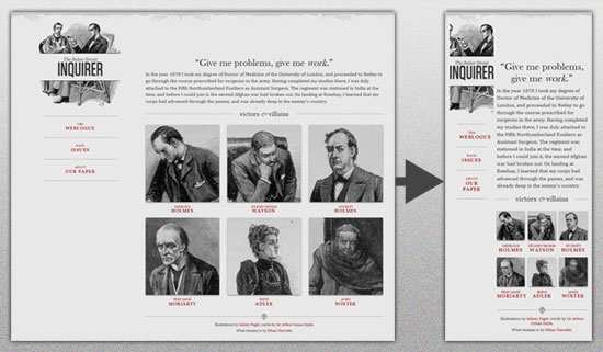
This means flexible everything and requires that you ensure all of your image, content and grids are fully fluid and will reconfigure accordingly on a wide assortment of screen sizes, such as these, which are only a small sampling of the very most popular screen sizes you’re likely to deal with.
The result should be a site that converts as nicely as
Design your Site with Responsive in Mind
When you’re wire framing your site layout together for coding into a real design, understand that there are layouts which are ideal for responsive design and those which are not, meaning there are designs that convert to assorted new sizes better than others thanks to their layout.
This means designing as simple a site layout and HTML code as possible and using simple mechanisms for core elements such as navigation and menu options, using HTML5 guidelines and doctype, and a simple overall core layout.
What you should avoid completely are things such as overly complex divs, useless absolute positioning, and fancy Javascript or Flash elements that will just complicate site adjustment on the whole.
Pay Attention to your Breakpoints
Resolutions can be defined in an assortment of breakpoints, but there are several major sizes that you need to focus on more than any others. These being:
<480px (which applies to older, smaller smartphone screen sizes)
<768px, which is ideal for larger smartphones and smaller tablets
>768px, which applies for everything bigger such as large tablet screens and desktops screens.
Also, these can be used too if you’ve got the energy and time:
<320px, which is great for older small, low res phones
>1024px stylesheet for wide screens on desktops.
These are the key breakpoints to focus on and especially the first three as well as the full desktop resolution, which is greater than 1024px.
Make your Images Flexible and Workable
With a simple design, you can make your images flexible as well to a certain degree. The easiest way to accomplish this is by simply using adaptative sizing and resizing their width.
You can do this in a variety of ways, but one of the easiest methods through which to achieve it is with this handy little tool: Adaptive Images. Bear in mind that sizing accordingly for mobile users is probably your best bet on a responsive design site if you want decent load speeds, which are absolutely crucial.
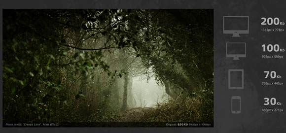
You could also use variable breakpoints and store multiple image sizes in your data for different screen resolutions, but this might become a problem in terms of bandwidth usage, and you cannot create your site with the safe assumption that all of your viewers will have access to powerful bandwidth.
Allow Compression of Site Elements and Content
Use a program such as GZIP to compress your page resources for easier transmission across networks. You’ll have lowered the number of bytes sent per page or element and made your content easier to browse and access from devices with varying or low bandwidth.
Furthermore, you can speed things up even further by removing any unnecessary white space and line breaks. Doing this will reduce file sizes overall and keep things flowing more smoothly.
Get Rid of Non-Essential Content
In order to make your mobile friendly responsive design site really shine in a very easy to achieve way, simply bear one thing in mind: Some content and content elements were never meant to be used in a mobile context and would never work there.
 Image by
If you have these elements at play in your website or potential site layout, then get rid of them immediately for any mobile setting. You can do this by adding a .not_mobile class to specific elements that you’d like to see removed when your site is viewed in a mobile context or you can simply get rid of such elements permanently from all versions of your site.
Remember the Bottom Line
The above are just some of the major best practices you can try out, some of the more important ones.
Ultimately however, if you want your responsive design site to work well, you need to build it so that it can load and function quickly on devices that will often have low resolution, small processing power and sometimes weak bandwidth access. This means a simple, well organized site that conforms to its core function with maximal focus.
Subscribe to:
Posts (Atom)